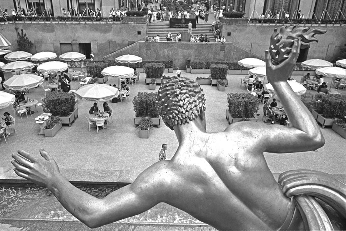
This photo disproves rules of depth of field/focus.
The rule is that, for greatest impression of extension of depth of field throughout a scene, one should focus 1/3 from the front of the scene and 2/3 from the back of the scene (1/3 from the nearest point to appear sharp and 2/3 from the farthest point to appear sharp). That is wrong, and has been wrong since the photo industry propagated it.
The reality is that, when the most important subject plane is precisely in focus (meaning the focal plane is placed exactly on that distance in the photo) no matter where that distance may be, the whole photo will take on the impression/appearance of greatest depth of focus than had the depth of field rules been followed.
This photo proves this truth, and has been used as an example of the real depth of field relationships since it was made in 1962. It has been shown all around the world to demonstrate this reality, to many of the most respected photographic and optical firms.
The focus is clearly on the head of the sculpture, which is nearly the closest plane to the camera in the photo. The head not only exhibits the greatest resolution, but the half-tones are most solid at that distance from the camera and the head takes on the impression of "plasticity", which is the impression of three-dimensionality on a two-dimensional surface. Also, that area/plane of the photo attracts the eye like no other part of the picture and it is truly difficult to look anywhere else in the photo. The eye/gaze keeps coming back to that head, as though attracted to it like a magnet. Cover the head or the whole sculpture in this photo, and the rest of the photo suddenly appears flat, two-dimensional, and not very sharp.
These effects of exact placement of the focal plane are present in all exactly focused photos. They are present in most of the portraits on this site, and are why so many of the portraits have a very special lifelike quality that almost jumps out at the viewer. They are also why those portraits are very exact, objective replications of the expressive/emotional realities of the people and their exact expressions. This effect is, of course, best seen in a larger printed
photo, which is why I made this photo 1100 DPI wide, rather than the
1024 of other photos on this site.
© 2006 Mark B. Anstendig. All rights reserved.
Gallery | People | Places | Pets | Odds and Ends | Messraster | Photos of Me | Anstendig Institute Artwork | Contact Me
Click on the Gallery to see the full list of categories.